Enjoying your Camera
Photograph of a Sunset in Big Bear, California
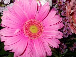
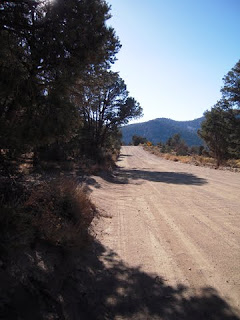
Most digital cameras have settings that can enhance your shot, I use a Nikon Coolpix. For this particular photograph I used the Sunset setting. This photo has NOT been altered in Photoshop. I did zoom so as not to catch the buildings and power lines that would have taken away from this shot. Don't be afraid to explore your settings, nowadays with digital photography you can simply delete the picture if you don't like it. Use your manual and get to know your camera. Take your camera for a hike or on a special early morning drive to practice closeup or landscape mode. Try using various modes for both early and late in the day including getting to know your flash. Believe me even the tiniest flower can have such power when taking a closeup into the deep inner feathery middle, pure spiral beauty. Explore and enjoy your surroundings, it will make you smile!
SPINgraphics
"Beautiful designs make lasting impressions."
Monday, April 19, 2010
Thursday, April 8, 2010
Wherefore ART Thou?
Where can you find Graphic Designs?
Think about it...
When you get up in the morning while looking forward to sipping your first hot cup of coffee, or tea as I do, and you read the newspaper it’s staring you right in the face. Headers, columns, subtitles, fonts and images. It’s right there when you pick up your favorite magazine off the rack. When driving you read signs, posters and billboards. All of it is full of various elements to attract you to view it.
These various elements surround us all day every day. Even when you turn on your computer and view a webpage or when you watch TV. This also applies to smaller items we don’t even think about needing a design, like the sleeves on your coffee cup, vitamin bottles, tissue boxes, gum wrappers and other various packages or products we see and buy daily. Other everyday items are your bank statements, letterheads, flyers, resumes, brochures and business cards that we hand out and receive from others on a regular basis.
Monday, March 22, 2010
Photo Retouching
Elements & Design
Photo of my mother when she was young
My father kept this photo beside his bed for many years and mom had one of dad on her side of the bed. Over the years the photo became damaged from sunlight and thereafter faded. After my mother passed away Dad asked if I could fix it so we could reframe it. I took the worn out photo home. I realized that a good portion of my moms hair and shoulder needed to be replaced along with fixing her fading image. I never did ask dad what was cut out of the photo that was next to mom. Photo retouching is fun work because your bringing an image back to life that you may have thought to be lost. I've retouched photo's to remove or add elements depending on the request. I have also retouched photo's that were once thought to be trash because of the fold mark on the families faces. Almost nothing is impossible!
Saturday, March 13, 2010
Basic Steps to photo resizing using Photoshop
Thursday, March 11, 2010
Advertising - Elements and Design
Elements & Design
Businesses located in Big Bear Lake, California.
Get the Burger, a local hamburger and milkshake hangout, needed a custom ad. By-the-way I love their burgers and fries. They needed an ad to take you back to a time when we went to malt shops to grab a burger and washed it down with a soda pop. The bubble was a cute way to advertise the use of REAL ice cream. If you come to Big Bear you have to try out this place.
Below are more ads I've developed for various companies in Big Bear. First Mountain Bank, Team Big Bear, Silver Pines Escrow, and Holloways Marina.
Magazine - Elements and Design
Elements & Design
Businesses located in Big Bear Lake, California.
 This is a 64 page magazine I designed for the Big Bear Chamber of Commerce. All elements for the layout, artwork, content, photography and ad work were either designed or processed by me. Some photography and text were provided by the Chamber. All design elements for this magazine worked around a historical theme of times past in Big Bear. Many of the pictures were given to us by a local history buff to use free of charge. This magazine became a keeper showing various historical points of interest in Big Bear. Many old pictures were from postcards and contained written notes to loved ones, these were included to provide interesting notes about the weather or vacation activities people were enjoying at the time. This made the magazine a fun read. I've designed a total of 3 magazines for the Big Bear Chamber of Commerce since 2007.
To view a pdf of the 09/10 Guide click here and navigate to Business Guide.
Businesses located in Big Bear Lake, California.
 This is a 64 page magazine I designed for the Big Bear Chamber of Commerce. All elements for the layout, artwork, content, photography and ad work were either designed or processed by me. Some photography and text were provided by the Chamber. All design elements for this magazine worked around a historical theme of times past in Big Bear. Many of the pictures were given to us by a local history buff to use free of charge. This magazine became a keeper showing various historical points of interest in Big Bear. Many old pictures were from postcards and contained written notes to loved ones, these were included to provide interesting notes about the weather or vacation activities people were enjoying at the time. This made the magazine a fun read. I've designed a total of 3 magazines for the Big Bear Chamber of Commerce since 2007.
To view a pdf of the 09/10 Guide click here and navigate to Business Guide.
Monday, March 8, 2010
Signs and Banners - Elements and Design
Signs and Banners
Elements & Design
Business located in Big Bear Lake, California.
Elements & Design
Business located in Big Bear Lake, California.
I designed this banner for the City of Big Bear Lake. The banners hang on the light poles in Big Bear Lake Village. Also when entering the Village from either Village Dr. or Pine Knot Ave. on Big Bear Blvd. you will see rectangle signs with the same design. These banners are designed to be used over and over in fall or winter. Simple and Clean.
Subscribe to:
Posts (Atom)


